
Ecommerce Landing Page Examples: Proven Patterns for Conversion
High-traffic means nothing if your landing pages aren’t moving carts. The best ecommerce landing page examples don’t just showcase products—they orchestrate a buying journey designed for performance. If your landing pages are merely “on-brand” or visually appealing, but conversions are soft, the missing ingredient isn’t creativity. It’s a deliberate blend of structure, psychology, and practical design that ties directly to revenue. This deep dive unpacks what today’s high-converting ecommerce landing pages share—and how to apply those winning elements to your next campaign or Shopify rollout.
What Winning Ecommerce Landing Pages Get Right
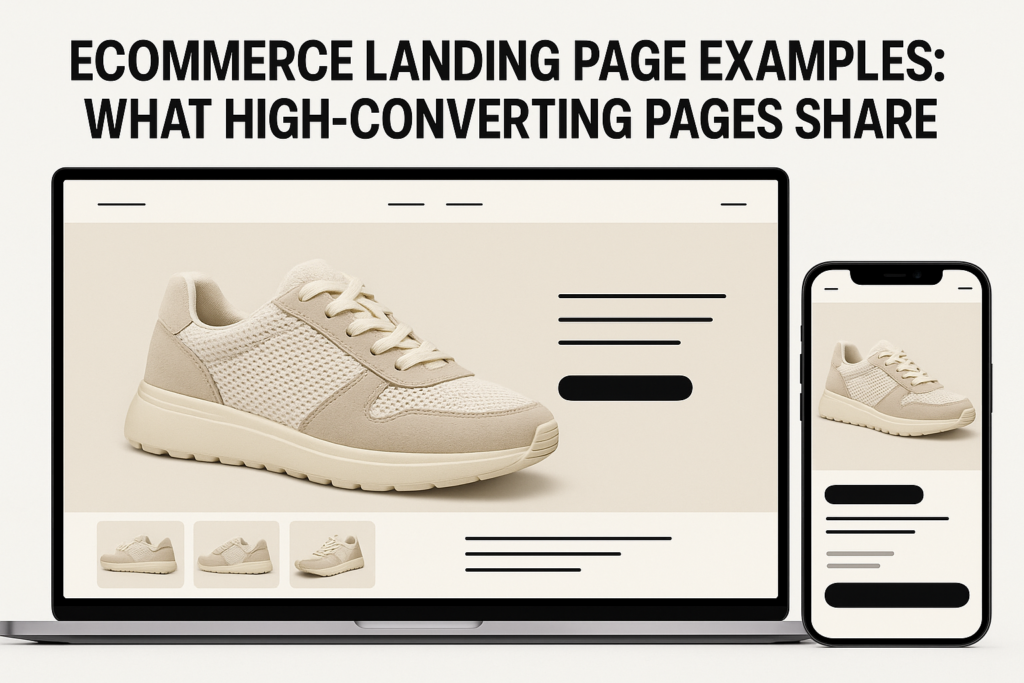
Behind every high-performing ecommerce landing page is a system—not just a layout. The strongest ecommerce landing page examples aren’t built on guesswork. They consistently follow a blueprint that surfaces the offer, builds trust fast, and removes barriers to checkout. Let’s break down what the most effective pages have in common:
- Immediate product clarity: Above-the-fold hero images, clear product names, and direct value statements earn attention in seconds.
- Social proof out front: Star ratings, headline testimonials, media mentions, or recognizable brand logos appear near the top.
- Simplified decision paths: One primary CTA (buy, subscribe, claim offer) dominates—eliminating distraction and ambiguity.
- Offer urgency and scarcity: Limited-time deals, low-inventory signals, or free-shipping countdowns nudge decisive action.
- Frictionless mobile UX: Critical details, payment icons, and thumb-friendly CTAs are fully optimized for mobile conversion.
Where many ecommerce landing pages fail is mistaking visual polish or lengthy feature lists for strategy. The sites that convert best build trust and sharpen intent within seconds—often before users ever scroll.
For a closer look at the landing page design decisions that drive these results, explore our landing page services—where practical UX and story flow are engineered for digital commerce outcomes.
The Conversion Blueprint—Sequencing Offer, Proof, and CTA
The architecture of high converting landing pages for ecommerce follows a specific conversion story arc. It’s not about arbitrary order—it’s about creating a logical, low-resistance funnel. Here’s what that looks like in practice:
- 1. Headline & UVP: The page opens with a headline that communicates the unique value proposition, not just the product name. (“The Only Noise-Canceling Headphones Designed for Travelers.”)
- 2. Hero Image or Demo: A contextual product shot or quick demo preview, fit to mobile and communicating use—not just aesthetics.
- 3. Social Proof & Trust Signals: Key review highlights, satisfaction badges, or brand/influencer endorsements giving a sense of real-world results.
- 4. Offer & Incentive: Immediate access to time-sensitive deals, bundles, or free bonuses. Display urgency explicitly (“12 hours left—save 20%”).
- 5. CTA Placement: A bold, mobile-friendly call-to-action button, always visible above and repeating down the page.
- 6. Objection Handling: Guarantee statements, FAQ snippets, and clear return policies placed near the primary CTA to minimize buyer hesitation.
- 7. Deep Product Detail (as needed): For higher-AOV or complex products, the scroll path introduces expanded info, use cases, and full reviews.
This sequencing isn’t just for aesthetics. It’s designed to align with how users scan, build trust, consider offers, and ultimately convert. Deviating from it—by hiding trust signals, delaying the offer, or splitting CTAs—directly hurts performance.
If you’ve tried “pretty” landing pages that underperform, the missing variable is typically the disciplined choreography of story, proof, and action. To see where your own landing page flow may be losing users, check out our Shopify conversion rate optimization services or use the checklist below.
Framework: The Ecommerce Landing Page Audit Checklist
When reviewing your own ecommerce landing page design or preparing to launch a campaign-specific page, use this evidence-based checklist:
- Is my unique offer (not just the product) visible above the fold?
- Are there at least two forms of social proof or credibility signals before the first CTA?
- Is the CTA language direct, action-driven, and answering buyer intent?
- Is there a clear, limited-time or quantity-driven incentive?
- Does the page present risk reversal (warranty, guarantee, support), not just product features?
- Are payment options, shipping, and returns easily spotted—especially on mobile?
- Do users see critical CTA buttons at every scroll depth, especially on mobile?
- Is anything non-essential (navigation, off-page links) minimized or hidden to prevent distraction?
Every high converting landing page in ecommerce can be mapped to these foundational criteria. Missing just one (especially on mobile) is often the difference between a successful launch and an expensive underperformer.
From Example to Execution—Optimizing for Shopify & DTC Growth
Most ecommerce landing page examples you’ll find online are “portfolio-ready,” but too many brands fail to translate them into revenue. The biggest misstep? Treating landing page design as a template swap—instead of a strategic sequence tailored to your buyers, channels, and lifecycle stage.
For Shopify and modern DTC brands, a few adaptations matter:
- Always custom-code or use a flexible page builder rather than default product templates—conversion lifts often justify the investment.
- Integrate dynamic blocks for reviews, live inventory, and incentives to personalize the offer by traffic source.
- Audit site speed and loading delays, especially for high-res hero images; conversion drops fast when images lag.
- Segment your landing page variants: are you serving traffic from paid ads, affiliates, or email? Each deserves its own flow anchored to the specific offer or audience.
When you’re ready to turn inspiration into impact, the safest next step is an outside-in audit. Even pages built using “the right tools” often miss the mark on proof sequencing, mobile detail stack, or persistent CTA placement. D2C Design’s practical approach to landing page and Shopify CRO ensures your next iteration is guided by data and human behavior, not design trends. See what matters most with a Free Audit.
Final Thoughts
The landing page patterns that drive ecommerce growth are clear, repeatable, and grounded in performance—not superficial trends. The best ecommerce landing page design is hyper-relevant to your buyer and ruthlessly focused on conversion. Master the sequence, cut friction, and benchmark against proven frameworks—you’ll see leads turn into sales by design, not by chance.
Curious how your ecommerce landing pages stack up against top-converting benchmarks? Request your free audit with D2C Design and get a practical analysis—so your next campaign launches optimized for real outcomes.
Common Questions
What are the most important elements of a high-converting ecommerce landing page?
The key elements include a clear headline and product value, strong hero visuals, rapidly visible trust signals (like reviews or guarantees), a focused CTA, urgency messaging, and seamless mobile UX. The structure and sequence matter as much as the content.
How do I know if my ecommerce landing page needs a redesign or CRO audit?
If your landing pages get good traffic but conversions are stagnant—or buyers drop off before checkout—it’s a sign your structure, offer flow, or trust elements may need to be reworked. Seasoned ecommerce growth teams review pages for conversion every major launch or campaign.
Should Shopify stores use custom landing pages or stick to templated layouts?
Custom landing pages or advanced page builders consistently outperform default templates because they allow for offer sequencing, dynamic content, and optimized mobile layouts—all key for conversion. Templates rarely accommodate the story and trust flow ecommerce requires.
What’s the difference between a product page and a dedicated ecommerce landing page?
A product page is designed for browsing and catalog navigation. An ecommerce landing page is targeted to a specific campaign or offer, with tailored story, proof, and CTA—minimizing distractions and maximizing conversions from focused traffic sources.