
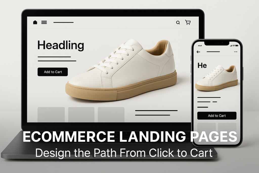
Ecommerce Landing Pages: Conversion-Driven Design Strategies
You have seconds to prove your offer—and even less to earn the next click. Despite spending on ads and campaigns, most ecommerce landing pages surrender revenue to preventable design and CRO oversights. If conversion rates, customer trust, or campaign ROI aren’t meeting targets, your landing page may be where the gap starts and ends. Getting ecommerce landing pages right is not about luck—it’s about applying proven design, UX, and performance strategies with commercial outcomes in mind.
Match Message to Motivation: The Non-Negotiable Foundation
The path from click to cart begins with a single question: does your landing page instantly confirm the promise made by your ad, email, or referring link? True performance-focused ecommerce landing pages always start with message match—the discipline of ensuring that every visual, headline, and offer on the page aligns precisely with what enticed the visitor. A poor match creates cognitive friction, increases bounce rates, and damages trust before a prospect has even considered your offer.
Here’s a practical test: If you run ten separate ads, each with a unique value proposition and product, do your landing pages mirror that exact promise in headline, copy, and imagery? Far too many organizations let campaigns send visitors to generic product or homepage experiences—effectively squandering targeting and media spend. Every campaign should have its own ecommerce landing page designed to “close the loop” on the original motivation that brought the visitor. Learn more about high-performance landing page strategy.
- Headline Clarity: Reflect the campaign promise above the fold.
- Visual Continuity: Use design assets or hero images that match ad creative.
- Offer Consistency: Show the same incentive, discount, or bundle presented in the original message.
Every disconnect at this stage can quietly tank conversion before buyers ever see your product’s real value.
Design for Detail, Proof, and Performance
Once message match is achieved, the next challenge is delivering just enough product detail, proof, and trust to help buyers act—without overloading or slowing the experience. Effective ecommerce landing page design is about highlighting what matters most for decision-making, removing what doesn’t, and making every micro-interaction serve clarity and persuasion.
Critical Elements for High-Converting Landing Pages:
- Concise Value Proposition: Explain why this product, for this buyer, right now—ideally in a single sentence.
- Focused Product Imagery: Use high-quality images or video that demonstrate use or results, not just product-on-white packshots.
- Proof and Trust Signals: Place reviews, testimonials, ratings, or guarantees close to the CTA—preferably above or just below the main fold.
- Speed and Simplicity: Minimize scripts, compress images, and design for fast first contentful paint. Slow pages lose conversions.
- Visual Hierarchy: Prioritize key information at the top, using whitespace and contrasting CTAs to guide the eye toward action.
Over-designed pages—which pile on carousels, excessive icons, excessive copy, or unnecessary badge clutter—cause buyers to pause or bounce. Cut noise, spotlight proof, and remember: clarity always beats cleverness in ecommerce landing page optimization.
Framework: The “4P” Lens for Landing Page Optimization
Use the “4P” lens as a practical checklist for performance-driven ecommerce landing pages:
- Promise: Does the headline clearly state what’s in it for the visitor (and match the ad’s offer)?
- Proof: Are there above-the-fold testimonials, reviews, or recognizable trust signals?
- Product: Is the hero image, explainer, or video direct and outcome-focused?
- Push: Is there a single, persuasive CTA (add to cart, buy now, join waitlist) above the fold and repeated intelligently?
Run each major landing page through this lens monthly. Identify bottlenecks, remove UX distractions, and measure changes relentlessly.
Controlling the Checkout Journey—Especially on Mobile
Even brilliantly designed ecommerce landing pages fall short if the path to purchase breaks down at the last mile: checkout. Here’s where many brands lose sale after sale to avoidable friction, especially on mobile, where attention is shortest and competing tabs are only a thumb-swipe away.
Best Practices for Shopify Landing Pages and Mobile Flow:
- One CTA, no distractions: Minimize secondary links and navigation beyond “add to cart” or “buy now.”
- Reduce form fields: Only ask for what’s required. Leverage built-in Shopify auto-complete options when possible.
- Speed to checkout: Eliminate unnecessary intermediary steps between adding to cart and payment.
- Visible progress indicators: Show buyers exactly how many steps remain, reducing anxiety.
- Large tap targets & readable fonts: Make every interaction effortless, especially for one-handed mobile use.
- Persistent cart reminders: If a user scrolls past initial CTAs, keep the cart or checkout button visible at the bottom of the screen.
Shopify stores have unique strengths here but are also prone to default templates that often dilute the focused path to purchase. Tactical use of Shopify landing page CRO can identify and resolve sticking points specific to your funnel, mobile layout, or target audience. Optimize, iterate, and monitor which screens lose visitors—and why—using analytics and real device testing.
Final Thoughts
Consistent performance from ecommerce landing pages isn’t an accident. It’s the result of strategic design, buyer psychology, and data-driven iteration—from message match to mobile checkout. If revenue is leaking, start here: scrutinize every stage of your click-to-cart journey, test with real users, and never settle for default templates or unproven design “trends.”
Ready to convert more of your traffic? Start with a complimentary website audit from D2C Design and identify your most critical landing page opportunities.
Common Questions
What makes an ecommerce landing page different from a standard product page?
Effective landing pages are purpose-built for a specific campaign or audience segment, with streamlined design, focused messaging, and a direct call to action—unlike general product pages that serve broader navigation.
How can I optimize landing pages for mobile conversions?
Prioritize fast load times, large tap targets, visible CTAs, and simple forms. Ensure checkout steps are clear and reduce navigation distractions for mobile users.
Does every ecommerce business need custom landing pages for campaigns?
If you invest in paid traffic, email, or influencer campaigns, custom landing pages are essential for maximizing relevance and conversion.
How do I know if my landing page is underperforming?
High bounce rates, low conversion percentages from specific sources, or inconsistent user journeys (especially on mobile) are key red flags. A targeted free audit can reveal specific issues.