
Ecommerce Website Homepage Design: Strategies for Higher Conversion
Your ecommerce homepage has a few seconds to prove its value—or lose a sale. Is your ecommerce website homepage design actively guiding visitors to core product categories, establishing trust, and driving next steps, or is it slowing down performance before the shopper even browses? At D2C Design, we know that poorly optimized homepages quietly drain revenue by making buyers work too hard and trust too little. In a down-to-the-decimal ecommerce world, every pixel and headline must have a conversion purpose.
The True Role of Ecommerce Homepage Design—More Than a Welcome Mat
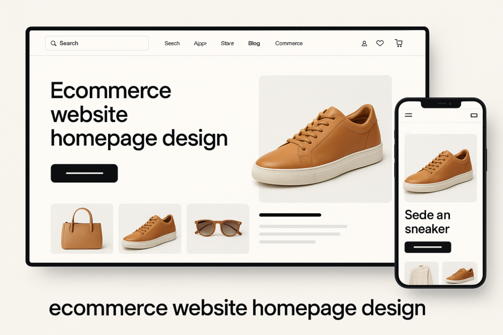
Your ecommerce homepage isn’t just a brand billboard or a digital business card. It’s the single most powerful entry point for your success—and the point where most shoppers make or abandon their first decision. Many brands still see the homepage as static, focusing on aesthetics rather than performance. But top direct-to-consumer brands treat it as their highest-leverage filter, directing visitors to bestsellers, new collections, and urgent offers.
Effective ecommerce website homepage design surfaces:
- High-value product categories for immediate discovery—never buried behind menus
- Trust and credibility elements (badges, reviews, press mentions) that remove doubt and increase buyer confidence
- Compelling value propositions and time-sensitive offers for urgency
- Crystal-clear next-step paths that channel intent (shop, subscribe, explore, or claim an offer)
Homepage design, then, is outcome-driven: its role is to connect the right visitor with the right destination, with no wasted time or doubt. Are you measuring every homepage choice by how it drives conversion rates or revenue per visitor?
Category Pathways, Value Props, and Trust—The Essentials Above the Fold
On high-converting ecommerce homepages, the top of the page—”above the fold”—sets the tone and guides immediate actions. Here’s a practical framework used by experienced ecommerce web design agencies:
- Navigation Prioritization: Place your highest-grossing or trending categories in the main menu or first navigation touchpoints. Feature what matters most—don’t make visitors hunt for products.
- Clear Value Statements: Top bar or hero section should communicate “why shop here”: free shipping, returns guarantee, price match, exclusive drops, or sustainable sourcing. Keep text crisp and benefit-driven.
- Trust Signals, Fast: Prominently display ratings, verified reviews, “as seen in” logos, certifications, or secure checkout badges. Instant credibility reduces hesitation, especially for new customers.
- Urgent Offers and CTAs: A homepage that includes new collection launches, limited-time discounts, or event-based messaging incentivizes action. Tie each offer to a direct call-to-action (“Shop Now,” “See New Arrivals,” “Get 10% Off Today”).
If you’re on Shopify, you likely have built-in blocks for these features and can maximize them with the right design priorities. D2C Design’s Shopify services help brands audit and implement these best practices specifically for Shopify themes.
Next-Step Design—Turning Homepage Interest into Action
Homepage performance isn’t measured by bounce rate alone—it’s about conversion-readiness. Every section, from navigation to featured banners, should remove obstacles and make the next step obvious. Here’s a simple decision lens for homepage layout:
- Does this element move a shopper closer to a meaningful action or purchase?
- Is there too much content, or not enough frictionless direction to core categories or popular products?
Practical design elements that reliably increase conversion rate optimization (CRO):
- Featured Collections: Spotlight bestsellers and new arrivals, ideally personalized by season, behavior, or traffic source.
- Sticky Announcements: Use sticky bars for next-level urgency—free shipping countdowns, cart threshold reminders, or flash sales.
- Interactive Banners: Rotating banners to test multiple offers or categories without crowding the visual hierarchy.
- Guided Content: “Find Your Fit” quizzes, product finders, or quick-shop capabilities to funnel buyers with intent.
This relentless focus on next-step clarity is why leading ecommerce design agencies treat the homepage as a dynamic conversion channel, not a static showcase.
A Practical Homepage Optimization Checklist
- Are your top-selling collections and hero products featured above the fold with strong calls to action?
- Can a new visitor understand your unique brand value or offer in two seconds?
- Are trust signals and third-party validations visible immediately—without scrolling?
- Is there a clear, visible path for both first-time and repeat visitors to proceed deeper or convert?
- Is homepage load speed fast and is the mobile UI frictionless?
If you can’t answer “yes” to each question, your homepage may be costing you sales and should be audited for conversion improvements. Consider leveraging a free audit for immediate, actionable insights tailored to your brand and revenue goals.
Map the homepage to useful buying steps
- Hero: make the value proposition and next action clear.
- Categories: provide relevant product entry points.
- Trust: surface genuine reviews and useful policy details.
- Offers: explain relevant promotions without obscuring product discovery.
- Brand story: give shoppers context for the brand and its products.
- Merchandising: connect bestsellers, new arrivals and relevant collections.
- Footer utility: make policies, support and key navigation easy to find.
Final Thoughts
Your ecommerce homepage operates as the control tower for brand growth, conversion velocity, and customer trust. Small homepage mistakes—hidden categories, weak CTAs, or missing trust signals—compound into major leaks in revenue and customer lifetime value. At D2C Design, we see the compound impact of superior ecommerce website homepage design every day: when every homepage element is engineered for conversion, growth follows naturally.
Ready to see exactly where your homepage is helping—or holding back—your business?
Request a Conversion-Focused Homepage Audit
Request a no-risk homepage audit from D2C Design and reveal precise opportunities for revenue lift, stronger user flows, and seamless upgrade paths for your ecommerce business.
Common Questions
What are the most important elements for high-conversion ecommerce website homepage design?
Critical elements include prioritized product categories, upfront value propositions, highly visible trust signals, persuasive offers, and clear calls-to-action. Each section should guide the shopper toward a meaningful next step within seconds.
How do I prioritize product categories and featured content on my ecommerce homepage?
Leverage sales data and analytics to feature your top-performing collections in the navigation and hero sections. These should be more prominent than secondary or informational content. Use badges and limited-time labels to highlight urgency when appropriate.
Why do trust signals and value props matter so much above the fold?
Visitors decide in seconds whether your brand is credible. Displaying reviews, media mentions, secure payment icons, and unique selling points early builds instant confidence—especially for new customers deciding whether to continue.
Can a homepage redesign really impact overall ecommerce conversion rates?
Absolutely. Strategic homepage redesigns remove decision friction, improve the path to purchase, and reinforce brand trust—often resulting in measurable improvements in conversion rates, order size, and repeat purchase metrics. Consider a free audit to scope the fastest impact areas.