
Ecommerce Website Design Examples: Proven Patterns That Convert
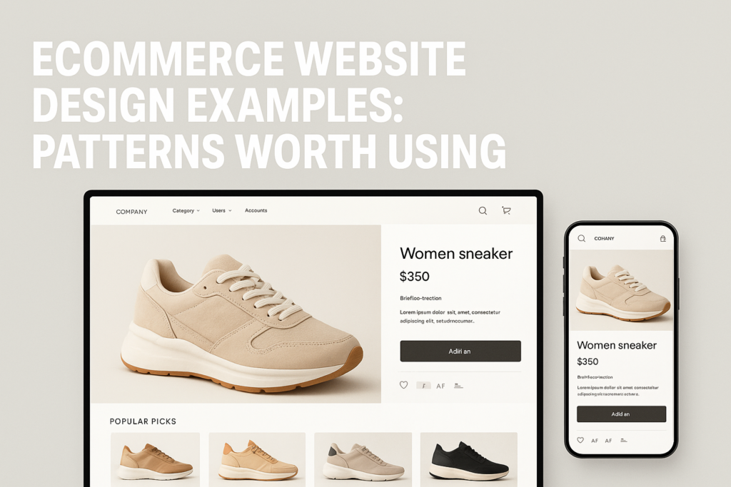
Most ecommerce sites look similar—yet only a select few transform traffic into revenue at scale. If you’re studying ecommerce website design examples, you’re not just chasing inspiration—you’re seeking real-world patterns that drive product discovery, customer confidence, and faster checkouts. Unfortunately, the business problem remains: copying what “looks good” rarely translates into higher conversion. What separates average ecommerce sites from those that are engineered to perform?
The Real Anatomy of High-Converting Ecommerce Websites
Truly effective ecommerce web design isn’t about the latest visual trends or clever animations. The best ecommerce website examples focus relentlessly on functional design patterns that actually drive conversion and revenue. This shift in thinking—from surface polish to behavioral UX—unlocks higher ROI on every marketing dollar you spend.
High-performing ecommerce website design services prioritize:
- Intuitive navigation: Category-first menus, predictive site search, and clear breadcrumbs that allow shoppers to jump between sections with zero guesswork.
- Rapid product scanning: Grid layouts, immediate access to top filters, and fast-loading visuals so users can quickly find items that match their intent.
- Mobile-first checkout: Streamlined pathways that minimize taps, autofill forms, and eliminate distractions on the path to purchase.
- Persuasive merchandising: Strategic use of promotional blocks, urgency cues, and FOMO-driven callouts only where they matter most.
What do these patterns have in common? They’re grounded in real user behavior, not design convention. It’s this commitment to function and testing that consistently separates leaders from followers.
Practical Patterns That Drive Product Discovery and Trust
Counting on a beautiful homepage or clever branding is a mistake if core discovery features are weak. Conversion-focused ecommerce website examples invest in user-centric features with measurable impact on behavior:
- Advanced filtering & sorting: Letting users instantly segment by price, category, or features increases engagement and cuts frustration. Filters and smart search are non-negotiable on stores with more than a dozen SKUs.
- Transparent value signals: Highlight reviews, trust badges, clear shipping expectations, and return policies near the point of consideration—not buried in footers. Customers convert faster when they feel informed and protected.
- Speed-optimized category pages: Lag hurts trust and discovery. Every microsecond shaved from listing page load time increases attention and session depth.
- Product photography that answers objections: Lifestyle imagery, zoomable details, and dynamic galleries build real consumer confidence—even before the first question is asked.
These elements build the “conversion backbone” of strong ecommerce web design, and they’re pivotal whether you sell ten products or ten thousand. If you need a partner for custom requirements or advanced filtering, see our ecommerce website design services.
Designing for Comparison and Checkout Momentum
A key difference in top ecommerce website design examples? They proactively anticipate buyer hesitations—especially during comparison and checkout.
- Side-by-side comparisons: Let users line up similar products with dynamic feature lists, price differences, and in-stock alerts. Minimizing tab-hopping keeps them in your funnel.
- Persistent cart visibility: Subtle, always-accessible cart icons and mini-cart drawers prevent confusion and offer “ready to buy” convenience.
- Streamlined forms: Autofill, progress indicators, and upfront input validation reduce checkout abandonment. The best sites never ask for more information than needed to complete the order.
- Proactive error messages and trust signals: Address mistakes and provide reassurance directly on the form, not via generic error popups.
Leading Shopify stores excel by mastering these patterns natively—or through targeted apps and custom development. If you’re seeking a Shopify-specific roadmap, our Shopify web design and development services are engineered to close these conversion gaps.
The Conversion Performance Framework: “CLEAR” Checklist
To assess or plan your ecommerce web design, use the CLEAR framework—grounded in proven ecommerce website design examples:
- C – Can shoppers compare options quickly and see key differences?
- L – Is product discovery linear and frictionless across devices?
- E – Do you offer evidence for trust (reviews, badges, clear policies) right where buyers decide?
- A – Are all calls-to-action actionable and close to products?
- R – Is the entire journey rapid—from landing on site to order confirmation?
Teams that apply CLEAR not only adopt the best ecommerce website design patterns, but also create a performance mindset across UX decisions and marketing spend.
A four-part storefront review
- Discovery: can shoppers locate relevant products and understand the category structure?
- Confidence: are product details, genuine reviews, guarantees and policies available at useful points?
- Comparison: can shoppers understand the meaningful differences between similar options?
- Momentum: can they move from selection to checkout without avoidable distractions or uncertainty?
Final Thoughts
The gap between “nice looking” and “conversion-driving” ecommerce sites is created—and closed—through strategic design execution. High-performing brands treat web design as a revenue lever, not a creative exercise. The fastest way to benchmark your own site’s gaps and opportunities? Don’t guess: get an outside perspective with a conversion-focused audit built for today’s buyer expectations.
Ready to discover what your ecommerce website might be missing? Request a Free Audit from D2C Design and get practical recommendations for growth, UX, and conversion improvement.
Common Questions
What makes an ecommerce website design “conversion-focused” versus simply attractive?
Conversion-focused ecommerce web design prioritizes user journeys, performance, and clarity over visuals alone. It uses proven UX patterns, clear calls to action, strong trust signals, and customer-centric flows to systematically reduce obstacles to purchase—not just create aesthetic appeal.
Which design patterns are proven to reduce friction from product page to checkout?
Patterns such as persistent cart icons, clear variant selectors, guest checkout, autofill-ready forms, progress indicators, and on-page trust signals (like shipping timelines and reviews) have consistently proven to increase completed purchases while minimizing drop-offs.
How do leading Shopify stores use design to outperform generic templates?
Leading Shopify sites layer in custom navigation, advanced filtering, speed optimizations, and targeted CRO enhancements on top of Shopify’s base framework. They focus on reducing ambiguity, increasing shopper confidence, and scaling merchandising techniques without sacrificing speed or clarity.
How can I evaluate if my current ecommerce site design is limiting revenue potential?
Begin by measuring conversion rates, bounce rates after key steps, and common abandonment points. Compare your UX against validated patterns used by top ecommerce website design examples. For an expert review, consider a Free Audit for custom insights on performance and conversion.