
This ecommerce case study shows how Buffy used a more disciplined Shopify approach to remove purchase friction, improve merchandising clarity, and support stronger conversion efficiency. More than a visual refresh, this engagement was built to solve growth constraints through UX, structure, and performance-led decision making.
As an ecommerce redesign case study and conversion optimization case study, the work focused on a clear commercial goal: create a faster, more intuitive shopping experience that could convert traffic more effectively and scale with demand.



Before the redesign, Buffy faced issues common in underperforming storefronts. The experience created friction in key buying moments, which reduced ecommerce performance and weakened the return on paid and organic acquisition.
The challenge was not simply aesthetics. The store needed a Shopify redesign that could improve clarity, reduce hesitation, and support better conversion rate optimization across the full journey.
This ecommerce redesign case study highlights a core issue in modern retail: weak site structure affects much more than usability. It impacts acquisition efficiency, customer trust, average order value potential, and long-term ecommerce growth.
In Buffy’s case, the existing experience limited Shopify store optimization because important commercial signals were not consistently visible at the right time. Product value, decision support, and purchase flow needed stronger alignment.
was needed to reduce decision fatigue
was required to support faster action
was necessary to improve merchandising performance
would allow the store to adapt as campaigns scaled
The redesign strategy was chosen because incremental fixes alone would not solve structural inefficiencies. A high-performance Shopify build offered the right balance of speed, flexibility, and scalability.
This conversion optimization case study was executed through a structured, revenue-oriented framework. Every change was tied to a business objective, not a design preference.
We started by identifying where users were slowing down, dropping off, or failing to move confidently through the funnel. This created a clear map of priority improvements and gave the redesign a performance baseline.
The next step was a Shopify UX redesign focused on reducing cognitive load and making the path to purchase more direct. Navigation, content sequencing, and decision-support elements were reorganized to better match shopper intent.
High-impact templates were refined to improve product evaluation and reduce abandonment. This part of the ecommerce CRO strategy focused on helping shoppers act with less hesitation.
Because mobile often carries the highest volume and the highest risk of friction, interface decisions were made with smaller screens in mind first. This improved usability where conversion pressure was most concentrated.
This Shopify success story was supported by implementation choices designed for speed, maintainability, and future iteration. The goal was not just a better storefront today, but a platform that could support ongoing optimization.
Brands considering a similar approach often begin with our Shopify services when they need redesign and implementation under one strategy.
As an ecommerce case study, Buffy demonstrates how strategic redesign work can improve more than headline metrics. The commercial value comes from better traffic utilization, stronger product engagement, and cleaner movement through the purchase journey.
This conversion optimization case study matters because conversion rate improvement compounds. When a store converts more of the traffic it already earns, paid media becomes more efficient, retention economics improve, and ecommerce results become more durable.
Strong redesigns fail when they focus on appearance without addressing conversion mechanics. In a real ecommerce redesign case study, the win comes from fixing structural friction, clarifying product value, and aligning the experience with buying behavior.
Most Shopify conversion optimization gains come from a small number of high-impact changes.
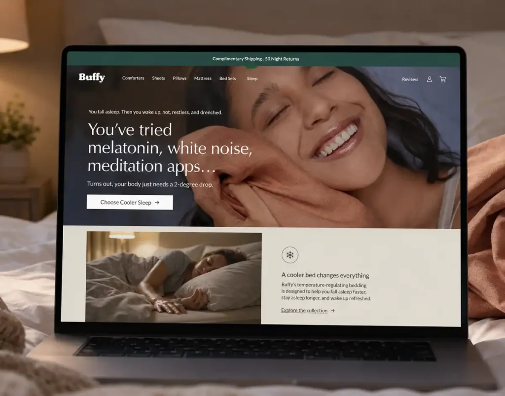
If your store is attracting traffic but under-delivering on conversion, the issue may be structural rather than promotional. Buffy’s outcome shows what can happen when redesign is guided by conversion logic, not opinion.
For brands evaluating their next move, a focused review can quickly reveal where revenue is being lost and what a stronger path forward looks like. Request a free audit to benchmark your current experience against high-performing Shopify standards and identify the highest-value opportunities for ecommerce growth.
This ecommerce case study connects storefront redesign decisions directly to conversion performance and revenue quality. It shows how UX, merchandising, and Shopify implementation work together to produce measurable business impact.
An ecommerce redesign is usually justified when the current experience creates friction that limits growth. Common issues include weak mobile UX, unclear product hierarchy, slow paths to purchase, and declining conversion efficiency.
A Shopify redesign improves conversion rate by making it easier for shoppers to understand products, build trust, and complete the next step. The strongest gains usually come from better structure, stronger page hierarchy, and reduced decision friction.
A conversion optimization case study should explain the business problem, the strategic interventions, and the resulting performance impact. It should also show how changes were mapped to buyer behavior and commercial outcomes.
Timing depends on scope, complexity, and stakeholder alignment, but most high-performance redesigns take several weeks to a few months. The right process prioritizes strategic clarity early so implementation can move efficiently.
A strong Shopify success story usually focuses on conversion rate, mobile engagement, drop-off reduction, average order value, and overall ecommerce results. The most useful metrics are the ones that show improved revenue efficiency, not just increased traffic.
If the store has strong fundamentals, CRO testing may be enough to unlock gains. If deeper structural issues are limiting user experience and merchandising clarity, a Shopify redesign is often the better commercial decision.
If acquisition is working but conversion remains weak, the store may be the constraint. Signs include poor mobile performance, inconsistent user flow, unclear product pages, and repeated friction in high-intent areas.