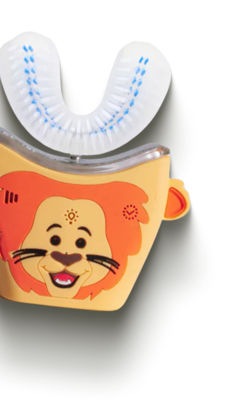
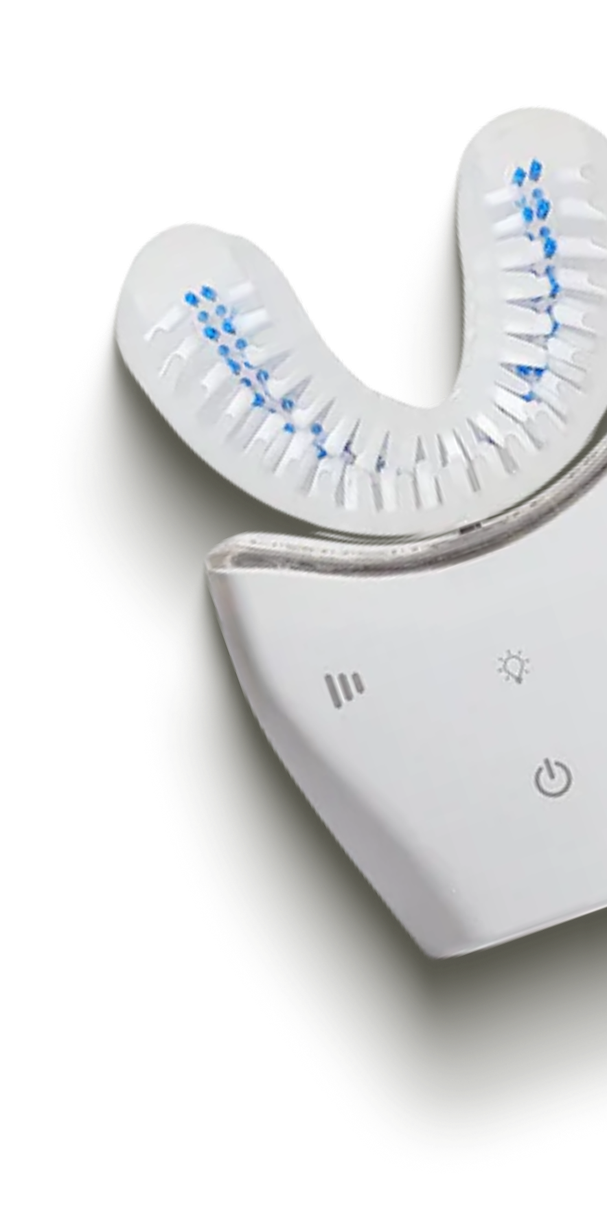
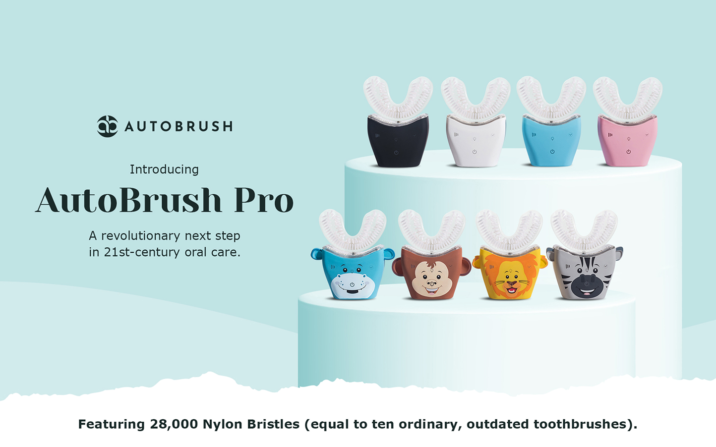
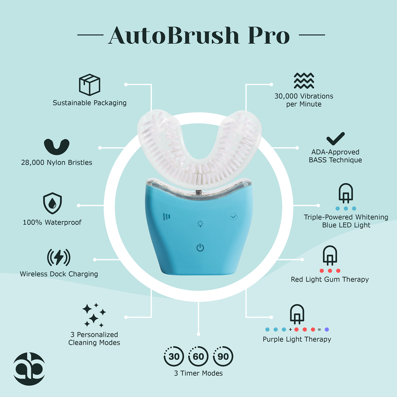
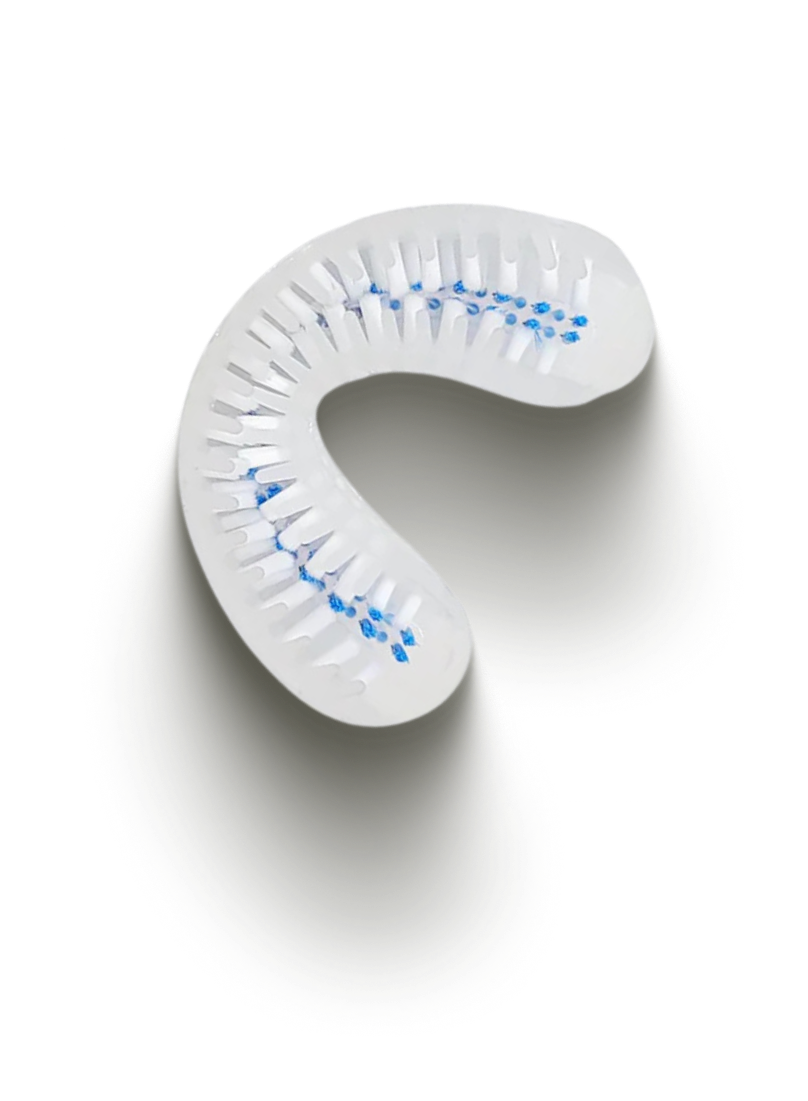
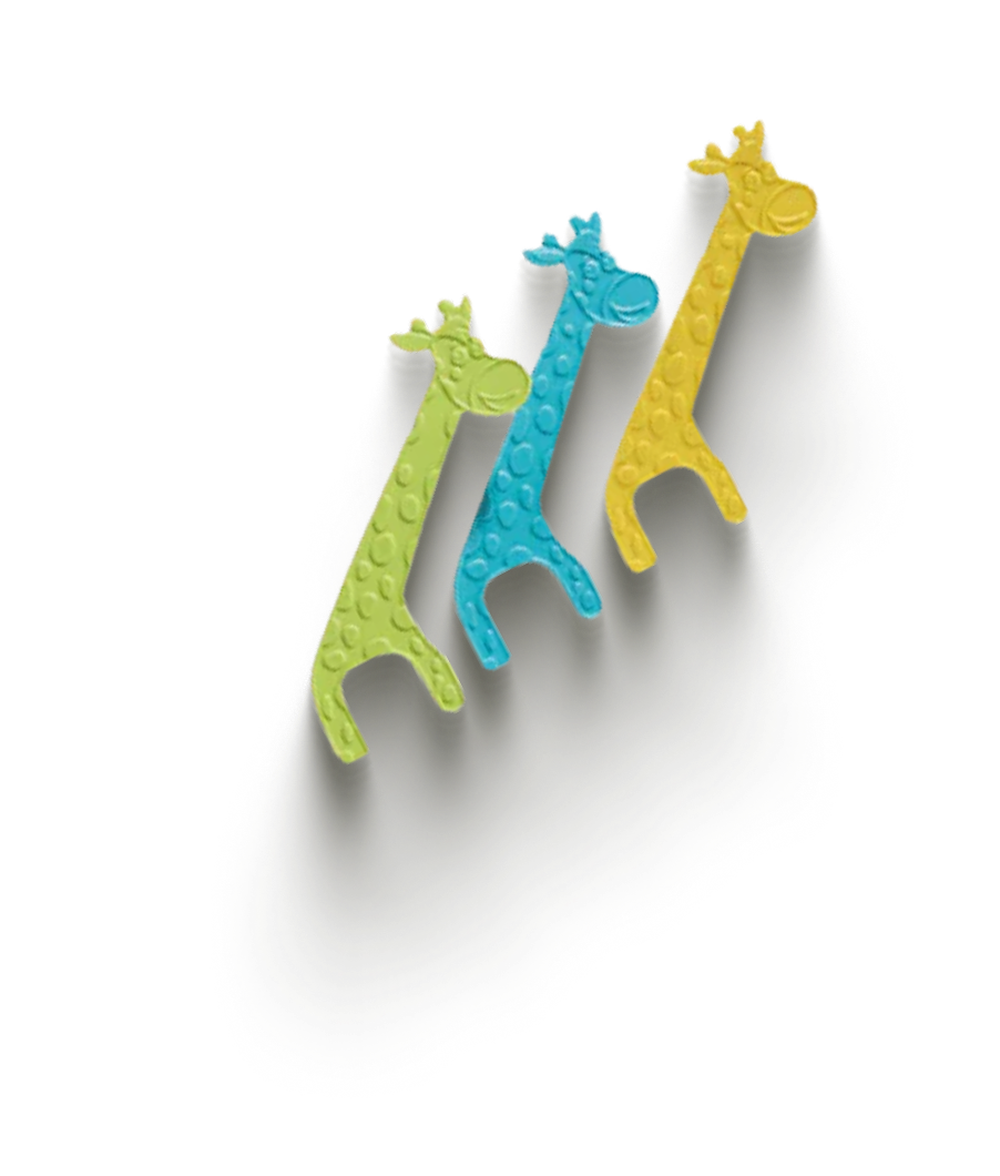
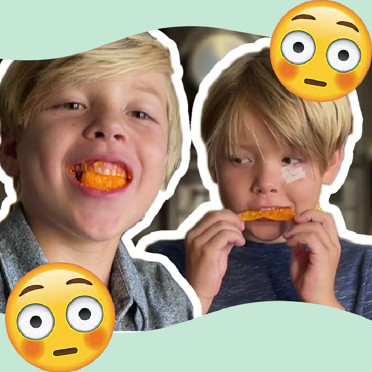
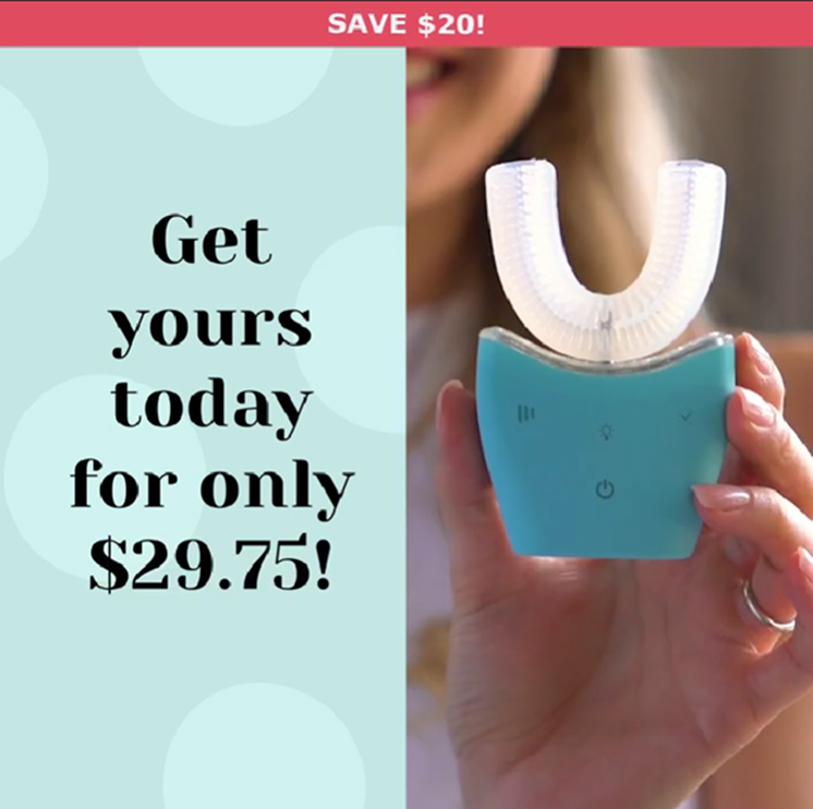
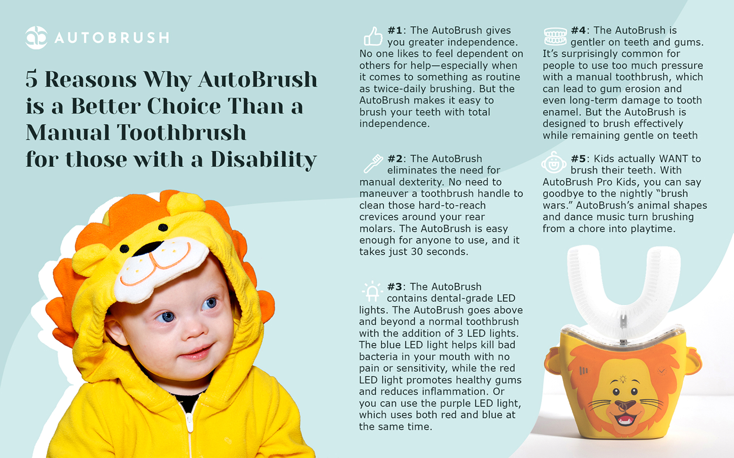
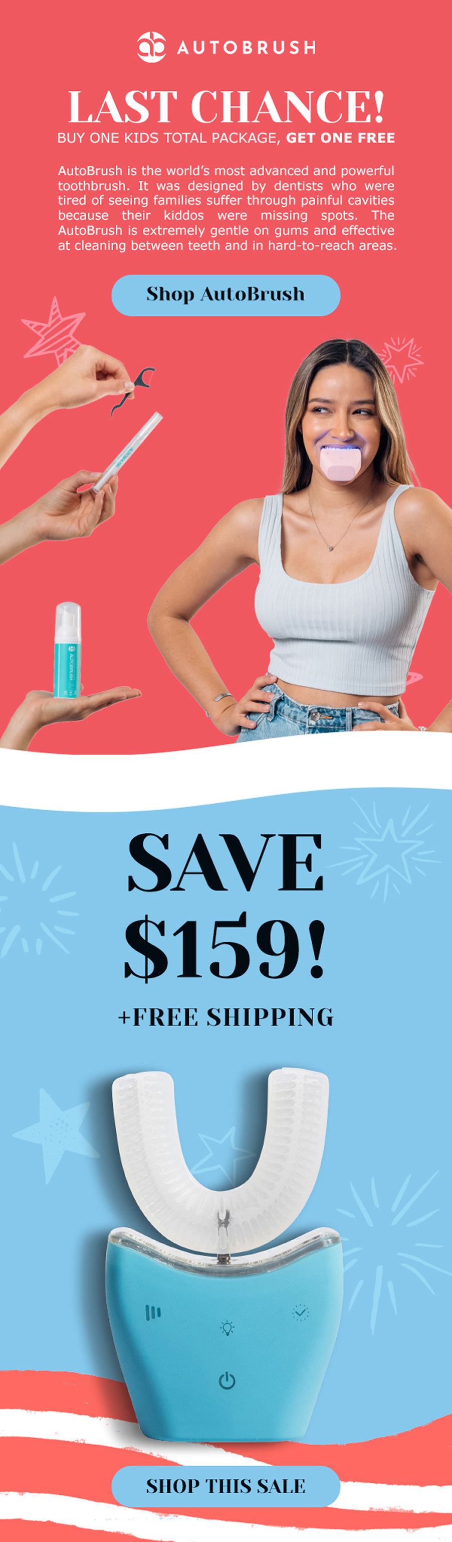
AutoBrush is reinventing oral care with a toothbrush that cleans every tooth in 30 seconds. Designed to make brushing effortless for kids and reassuring for parents, the brand blends fun with clinically backed results. Our work brought that promise to life across channels, turning curiosity into trust and browsers into buyers.
Visit Autobrush >
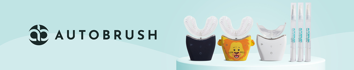
Our Role:
Ads
Amazon Page
Video Editing
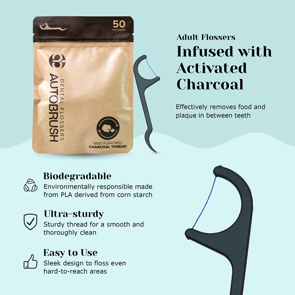
Infographics
Packaging
Email Assets
Banners